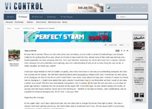
It looks like it worked! There are still a few kinks here and there, but all credit to André (CreativeForge) and Claudio (Todo10) for pulling this off so well. (Much as I'd like to take credit for this, almost none of the work was done by me.) André especially has been amazing with this. He's very talented, obviously, but we're also lucky he's a regular member here, because the extra attention we're getting, plus the understanding of why all of us here thing the way we do, is really valuable. So thank you, André!
I also owe major thanks to Piet De Ridder (re-peat), who many here know is not only an outstanding composer, but also has a great eye for design. We had been emailing about some Soundboard related stuff, and I mentioned we were going to be changing the look of this forum and I hinted that I was never crazy about the logo and I wonder if maybe we should look at changing it. I might have added that golly, maybe I could learn how to use Illustrator so then I could try to make a better one myself. The hint was shamelessly transparent, but it worked. He took the bait and sent us a number of great logo options, including the one we picked at the upper left. I love that logo. He also helped (along with André, of course) with the layout balance (which we're still working on - Xenforo is not easy to tweak), color coordination, and he supplied the textured backgrounds. All for free. I owe you, Piet!
Regarding the changes:
At the upper right, you'll see a crescent-moon / light-bulb icon. You can click that to change the forum from light to dark. This was a request we'd been getting previously, but hadn't been able to implement until now. (Forum layout stuff is surprisingly complicated. Xenforo definitely ain't Wordpress.)
Next to that light bulb is an on/off switch. (Maybe a gear icon would be better, but that's a thought for another time.) There are a number of settings you can change there, so it's definitely worth a look. André made some videos about them here.
There are still some tweaks we need to make, like having the thread title appear at the top of the page, and maybe making a more obvious distinction between "What's New" (includes threads you already recently visited) and "Latest Posts" (excludes threads with no new replies since your last visit.)
It will also take some time to settle into exactly what the best font sizes and background colors should be. For that kind of stuff, I'm inclined to make changes slowly, rather than quickly, since there's a certain amount of getting used to the new look that will need to happen before we get too crazy with changes.
FWIW, I don't mind change suggestions, and I don't take those requests as being disrespectful or dismissive of our efforts, so please feel free to make suggestions. We are definitely checking the various threads and making notes of everything.
I also owe major thanks to Piet De Ridder (re-peat), who many here know is not only an outstanding composer, but also has a great eye for design. We had been emailing about some Soundboard related stuff, and I mentioned we were going to be changing the look of this forum and I hinted that I was never crazy about the logo and I wonder if maybe we should look at changing it. I might have added that golly, maybe I could learn how to use Illustrator so then I could try to make a better one myself. The hint was shamelessly transparent, but it worked.
 He took the bait and sent us a number of great logo options, including the one we picked at the upper left. I love that logo. He also helped (along with André, of course) with the layout balance (which we're still working on - Xenforo is not easy to tweak), color coordination, and he supplied the textured backgrounds. All for free. I owe you, Piet!
Regarding the changes:
At the upper right, you'll see a crescent-moon / light-bulb icon. You can click that to change the forum from light to dark. This was a request we'd been getting previously, but hadn't been able to implement until now. (Forum layout stuff is surprisingly complicated. Xenforo definitely ain't Wordpress.)
Next to that light bulb is an on/off switch. (Maybe a gear icon would be better, but that's a thought for another time.) There are a number of settings you can change there, so it's definitely worth a look. André made some videos about them here.
There are still some tweaks we need to make, like having the thread title appear at the top of the page, and maybe making a more obvious distinction between "What's New" (includes threads you already recently visited) and "Latest Posts" (excludes threads with no new replies since your last visit.)
It will also take some time to settle into exactly what the best font sizes and background colors should be. For that kind of stuff, I'm inclined to make changes slowly, rather than quickly, since there's a certain amount of getting used to the new look that will need to happen before we get too crazy with changes.
FWIW, I don't mind change suggestions, and I don't take those requests as being disrespectful or dismissive of our efforts, so please feel free to make suggestions. We are definitely checking the various threads and making notes of everything.
Last edited:


