What's new

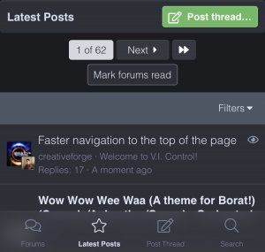
Faster navigation to the top of the page

creativeforge

the plumber
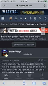
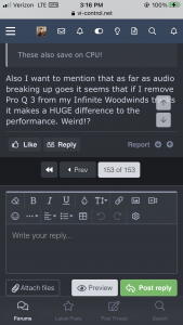
From now on, you can navigate faster to the top or bottom of the page by using the little arrows on the right side of the posts footer (right beside the word Bookmark). This eliminates a mouse move to the side of the page.

e2df2a7873b08f2ee691df9ad6048c49.jpg

Ye! :emoji_nerd:

Cheers,

Andre

p.s. In a week or so, I'm thinking of removing the former arrows which needed us to first initiate scrolling to display them, and then we could click on one of them. A bit bothersome, I find...

17d19315ffd4f7525f972d136aaa02d9.png
 
Last edited:
p.s. In a week or so, I'm thinking of removing the former arrows which needed us to first initiate scrolling to display them, and then we could click on one of them. A bit bothersome, I find...

17d19315ffd4f7525f972d136aaa02d9.png
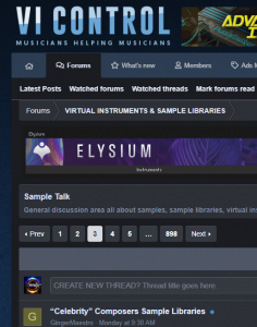
Honestly, the ability to move forward or back by page(s) at the top of the mobile site (in addition to the existing bottom) would be the most helpful, in my opinion at least.
 
Thanks for pointing this out, that was a great suggestion!

Andre
Thanks for listening!

...and while we're on the subject of the top of the mobile page:

IMG_3362.jpeg

Ever since the major redesign (I think?) I have had two 'notification bell' icons.

Why is this? Is it the same for anyone else?
 
Thanks for listening!

...and while we're on the subject of the top of the mobile page:

IMG_3362.jpeg

Ever since the major redesign (I think?) I have had two 'notification bell' icons.

Why is this? Is it the same for anyone else?

Yes, I tried everything I could find to remove the extra one. But if I remove it, for some reason it removes the first post on a thread or something. Really weird. I'll see if I can mask it, though.
 
Thanks for listening!

...and while we're on the subject of the top of the mobile page:

IMG_3362.jpeg

Ever since the major redesign (I think?) I have had two 'notification bell' icons.

Why is this? Is it the same for anyone else?

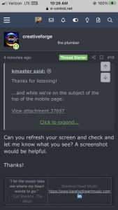
Can you refresh your screen and check and let me know what you see? A screenshot would be helpful.

Thanks!
 
So the theme for Bocrat is the first post title? Can you see more on your screen of is the header, ads and top menu occupying 90% of your screen? :emoji_astonished:
 
Top Bottom